Select it!
Styling new HTML UI capabilities
UI
Foundation of creating a good UI
Common UI
Choosing libraries
-
Controllable / expandable?
Multi-purpose? performant? -
Accessible?
Assistive tech and keyboard? -
Stylable?
Easy to fit the branding
Trade-offs
Trade-offs
Styling
Trade-offs
Accessibility
Trade-offs
Performance
Styling UI belongs in CSS
Things are getting better
(and about time too)
Hi, I'm Brecht
Front-end developer / DevRel
@utilitybend.com


Part of W3C (community) groups
- Open UI
- CSS-Next (CSS4 & 5)
Allow web developers
to style and extend built-in web UI
controls
!important
The mission is not to replace
current web-ui
Open UI
Is a W3C community group working towards stylable and extendable web-UI controls. More info: open-ui.org
- Research around parts, states and behaviour
- Research on existing design systems
- Mapping out the common ground
Open UI origins
Open UI Origins
The Popover API


Open UI Origins
Invokers
Invoker commands are available in:
(dialogs, popovers, custom controls) 
What do popovers and modals have in common?
Popovers, modal
The top-layer
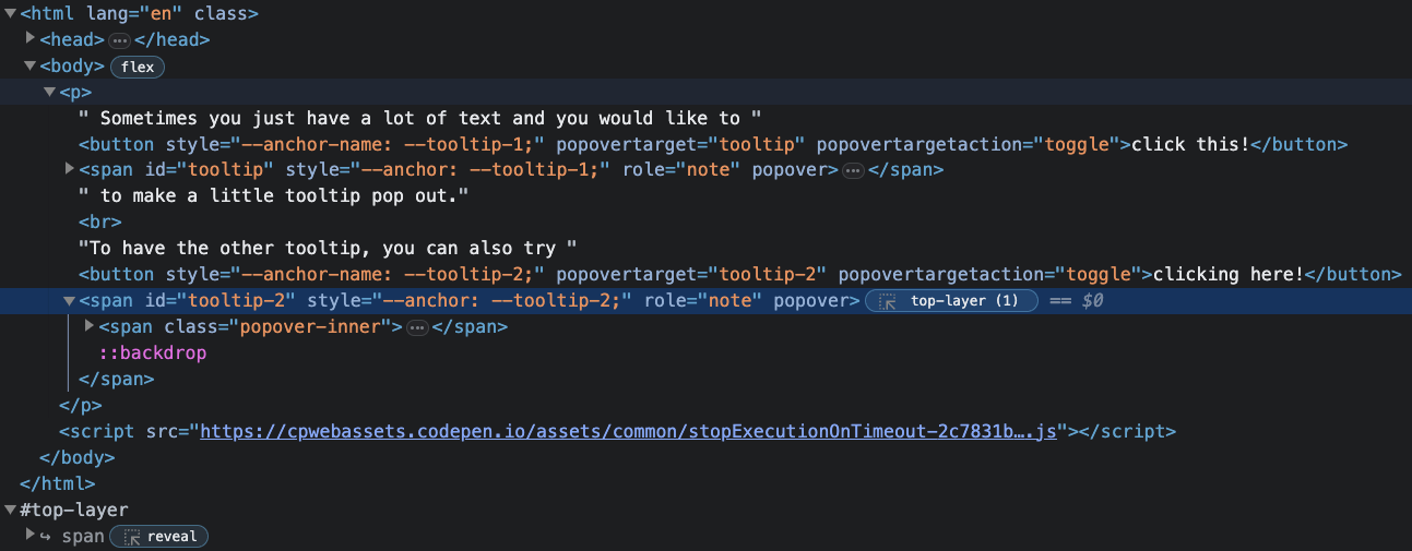
The top-layer
Because a popover, dialogs, and pickers should be on top of everything. This makes perfect sense
- Outside of the document flow
- No worries about z-indexes
- Gets created and destroyed instantaneous
Transitioning top-layer
@starting-style & transition-behavior
[popover] {
    opacity: 0;
    translate: 0 -30px;
    transition-property: opacity, translate, overlay, display;
    transition-duration: 0.8s;
    transition-behavior: allow-discrete;
    &:popover-open {
      opacity: 1;
      translate: 0;
      @starting-style {
        opacity: 0;
        translate: 0 30px;
      }
    }
  }
}
Breaking it down: transition-behavior
[popover] {
  opacity: 0;
  translate: 0 -30px;
  transition-property: opacity, translate, overlay, display;
  transition-duration: 0.8s;
  transition-behavior: allow-discrete;
  &:popover-open {
    opacity: 1;
    translate: 0;
  }
}
adding @starting-style
[popover] {
    opacity: 0;
    translate: 0 -30px;
    transition-property: opacity, translate, overlay, display;
    transition-duration: 0.8s;
    transition-behavior: allow-discrete;
    &:popover-open {
      opacity: 1;
      translate: 0;
      @starting-style {
        opacity: 0;
        translate: 0 30px;
      }
    }
  }
}
transition-behavior is available in:
@starting-style is available in:
()
Let's get started
Styling Select Elements

The basic select
Controllable, Accessible, less stylable
- Not possible to style the listbox
- A lot of dependencies for some styling
A customizable select
Upgrading the HTML element
- Backwards compatible
- Is controllable, accessible and stylable
- Opt-in via CSS
select,
::picker(select) {
  appearance: base-select;
}
⚠️Pre-note: Label your elements!
<label for="unique-id">Select theme</label>
<select id="unique-id">
    <option>Dark</option>
    <option>Light</option>
</select>
Part 1
Progressive enhancement
Customizable select:
Styling a select
select,
::picker(select) {
  appearance: base-select;
}
Progressive enhancement
select {
  @supports (appearance: base-select) {
    &,
    &::picker(select) {
      appearance: base-select;
    }
  }
}
The real world...
select {
  appearance: none;
  @supports (appearance: base-select) {
    &,
    &::picker(select) {
      appearance: base-select;
    }
  }
}
Style for everyone
select {
  appearance: none;
  display: flex;
  justify-content: space-between;
  align-items: center;
  background: hotpink url("arrow.svg") right 10px center / 20px no-repeat;
  /* ... etc ... */
  @supports (appearance: base-select) {
    &,
    &::picker(select) {
      appearance: base-select;
    }
  }
}
Styling the select
select {
  /* Previous properties */
  background: hotpink url("arrow.svg") right 10px center / 20px no-repeat;
  @supports (appearance: base-select) {
    & {
      background-image: none;
    }
    &::picker-icon {
      content: "";
      background-image: url("arrow.svg");
    }
  }
}
Styling the ::picker-icon
select {
  /* Previous properties */
  background: hotpink url("arrow.svg") right 10px center / 20px no-repeat;
  @supports (appearance: base-select) {
    background-image: none;
    &::picker-icon {
      content: "";
      background-image: url("arrow.svg");
      transition: rotate 0.2s ease-out;
    }
     &:open::picker-icon {
      rotate: 180deg;
    }
  }
}
Styling the ::picker(select)
select {
  /* ... */
  @supports (appearance: base-select) {
    /* ... */
    &::picker(select) {
      padding: 0;
      margin-block: 5px;
      border: 2px solid hotpink;
      /* ... */
    }
  }
}
Styling the options
option {
  padding: 10px;
  border-top: 1px solid plum;
  &:where(:hover, :focus, :active) {
    /* ... */
  }
  &:checked {
    /* Create my own checked style */
  }
  &::checkmark {
    display: none;
    /* Hide the little checkmark */
  }
}
Transition
&::picker(select) {
  /* previous code */
  opacity: 0;
  height: 0;
  transition-property: height, opacity, overlay, display;
  transition-duration: .5s;
  transition-timing-function: ease-out;
  transition-behavior: allow-discrete;
}
&:open::picker(select) {
  opacity: 1;
  height: calc-size(auto, size);
  @starting-style {
    opacity: 0;
    height: 0;
  }
}
Part 1b
Enhanced capabilities
Images
<select>
  <option value="pokeball">
    <img src="pokeball.svg" alt="" />
    <span class="text">Pokeball</span>
  </option>
  <option value="greatball">
    <img src="great-ball.svg" alt="" />
    <span class="text">Great ball</span>
  </option>
  <option value="ultraball">
    <img src="ultra-ball.svg" alt="" />
    <span class="text">Ultra ball</span>
  </option>
</select>
selectedcontent
<select>
  <button>
    <selectedcontent></selectedcontent>
  </button>
  <option value="pokeball">
    <img src="pokeball.svg" alt="" />
    <span class="text">Pokeball</span>
  </option>
  <!-- other options -->
</select>
selectedcontent
<select>
  <button>
    <selectedcontent></selectedcontent>
  </button>
  <option value="pokeball">
    <img src="pokeball.svg" alt="" />
    <span class="text">Pokeball</span>
  </option>
  <!-- other options -->
</select>
visually(!) hide text
selectedcontent .text {
  clip: rect(0 0 0 0);
  clip-path: inset(50%);
  height: 1px;
  overflow: hidden;
  position: absolute;
  white-space: nowrap;
  width: 1px;
}
That's the basics!
Let's crank it up
Part 2
Anchoring
The base HTML
<select aria-label="Select a potion">
  <button>
    <selectedcontent></selectedcontent>
  </button>
  <div class="items">
    <option value="health">
      <svg class="icon icon-health" aria-hidden="true">
        <use xlink:href="#potion" />
      </svg>
      <span>Health</span>
    </option>
      <!-- other options -->
  </div>
</select>
Anchoring the ::picker
select {
  &::picker(select) {
    top: anchor(center);
    left: anchor(center);
    translate: -50% -50%;
    /*  Removing some UA styles */
    margin: 0;
    padding: 0;
    background: transparent;
    border: none;
  }
}Fan effect
:root {
  --option-size: 80px;
  --circle-size: 320px;
}
/* Option, circle size set on root */
option {
  --half-circle: calc(var(--circle-size) / -2);
  width: var(--option-size);
  aspect-ratio: 1;
  margin: calc(var(--option-size) / -2);
}
/* Rotation calculation */
.items:has(option:nth-child(2)) {
  --rotation-divide: calc(360deg / 2);
}
/* ... 3-5 */
.items:has(option:nth-child(6)) {
  --rotation-divide: calc(360deg / 6);
}
Fan effect
/* Rotation set on each child and animation */
option:nth-child(1) {
  --deg: var(--rotation-divide);
  --negative: calc(var(--deg) / -1);
}

/* ... 3-5 */
option:nth-child(6) {
  --deg: calc(var(--rotation-divide) * 6);
  --negative: calc(var(--deg) / -1);
}

/* Set transform when open */
select:open option {
  transform: rotate(var(--deg)) translate(var(--half-circle))
    rotate(var(--negative));
  opacity: 1;
}
Part 3
sticky options
HTML
<select>
  <div class="items">
    <option>👍</option>
    <option>😂</option>
    <option>😍</option>
    <option>😢</option>
    <option>😡</option>
  </div>
</select>
Transition keywords
:root {
  @supports (interpolate-size: allow-keywords) {
    interpolate-size: allow-keywords;
  }
}

select, ::picker(select) {
    appearance: base-select;
    width: 64px;
    height: 64px;
}
Always show picker
::picker(select) {
    inset-block: anchor(top) anchor(bottom);
    overflow: clip;
    transition: width 0.5s ease-out, display 0.5s, overlay 0.5s;
    transition-behavior: allow-discrete;
    /* borders, colors,... */
}

select:open::picker(select) {
  display: flex;
  width: auto;
  @starting-style {
    width: 64px;
  }
}
Sticky checked option
.items {
  display: flex;
  overflow: auto;
}

option {
  flex: 0 0 64px;
  &:checked {
    position: sticky;
    inset-block: 0;
    inset-inline-end: 0;
    z-index: 1;
  }
}
Part 4
:has()
Question from Brecht:
When creating a character model, it must require you to enter some zen state, any tips for getting in that state?
Yeah! Just try to do something smaller
<select class="basket-container">
  <button>
    <selectedcontent></selectedcontent>
    <div class="dumpling-container">
      <div class="dumpling">
        <div class="top-pleats">
          <!-- top pleats -->
        </div>
        <div class="face">
          <div class="eye-surprised eye-surprised-left"></div>
          <div class="eye-surprised eye-surprised-right"></div>
          <!-- More face features -->
        </div>
      </div>
      </div>
      <div class="basket"><!-- Basket --></div>
   </button>
   <div class="items">
      <option></option>
   </div>
</select>
114 lines of HTML and 700 lines of CSS later..
Use :has() for value check
select {
  &:has(option[value="1"]:checked) {
    .dumpling:not(:first-child) {
      transform: translate(0, 200%);
    }
    .dumpling:nth-child(3) {
      transform: translate(-50%, 200%);
      transition-delay: 0s;
    }

  &:has(option[value="2"]:checked) {
    .dumpling:nth-child(3) {
      transform: translate(-50%, 200%);
      transition-delay: 0s;
    }
  }
}
Use :has() for facial features
select:has(option[value="1"]:checked) {
  .eye-surprised {
    height: 1px;
  }
  .mouth-surprised {
    height: 5px;
  }
}

select:has(option[value="2"]:checked) {
  .eye-surprised {
    height: 1px;
    height: calc(var(--dumpling-size) * 0.05);
  }
  .mouth-surprised {
    width: calc(var(--dumpling-size) * 0.05);
    height: calc(var(--dumpling-size) * 0.05);
  }
}
Part 5
Scroll Snap
<select aria-label="Monster Hunter items">
  <button class="trigger">
    <selectedcontent></selectedcontent>
  </button>
  <div class="frame"></div>
  <div class="items" id="itemlist">
    <option>
      <div class="item">
        <svg class="icon" aria-hidden="true">
          <use xlink:href="#potion" />
        </svg>
        <div class="title">
          Potion
        </div>
        <div class="amount">10</div>
      </div>
    </option>
    <!-- other options -->
  </div>
</select>
.items {
display: flex;
z-index: 1;
scroll-snap-type: x mandatory;
overscroll-behavior-x: contain;
overflow-x: auto;
scrollbar-width: none;
scroll-behavior: smooth;
}option {
container-type: scroll-state;
}
svg {
scale: 0.6;
transition: scale 0.2s ease-out;
@container scroll-state(snapped: inline) {
scale: 1;
}
}itemlist.addEventListener("scrollsnapchange", (event) => {
event.snapTargetInline.focus();
});Part 5b
Scroll markers
<label for="weather-select">Select your weather</label>
<select id="weather-select">
  <button>
    <selectedcontent></selectedcontent>
  </button>
  <div class="carousel">
    <div data-img="url(sunny.svg)">
      <option>
        <div class="weather-cell sunny-bg">
          <img src="sunny.svg" alt="" />
          <div class="icon-title">Sunny</div>
        </div>
      </option>
    </div>
    <!-- others -->
  </div>
</select>
.carousel {
anchor-name: --carousel;
scroll-marker-group: after;
&::scroll-marker-group {
position-anchor: --carousel;
/* anchor positions based on .carousel in picker */
}
}
.carousel > * {
--image: attr(data-img type(<image>), "");
&::scroll-marker {
background: #66c3ff var(--image, none);
}
}
⚠️ Accessibility concerns
Some of these are experiments, do test for all your users
- Keyboard navigation seems off (double jump options)
- Screen readers ignore scroll-marker here
- But who knows, fixable?
And more...
attr(), optgroup, ...
<select>
  <button>
    <selectedcontent></selectedcontent>
  </button>
  <optgroup value="Winter">
    <!-- options -->
  </optgroup>
  <optgroup value="Spring">
    <!-- options -->
  </optgroup>
  <optgroup value="Summer">
    <!-- options -->
  </optgroup>
  <optgroup value="Fall">
    <!-- options -->
  </optgroup>
</select><select>
<button>
<selectedcontent></selectedcontent>
</button>
<optgroup value="Winter">
<option value="snowflake">❄️</option>
<option value="xmas">🌲</option>
<option value="gifts">🎁</option>
</optgroup>
<optgroup value="Spring">
<!-- And more -->
</optgroup>
</select>optgroup {
/* Category label */
&::after {
content: attr(value);
color: var(--text-color);
position: absolute;
opacity: 0;
}
&:hover,
&:has(option:hover),
&:has(option:focus-visible) {
&::after {
opacity: 1;
}
}
}Coming up...
Experimental web platform features

<select>
    <option value="80s">
      <span>80s</span>
    </option>
    <option value="90s">
      <span>90s</span>
    </option>
</select><select multiple>
<div class="options">
<option value="80s">
<svg class="icon" aria-hidden="true">
<use href="#80s"></use>
</svg>
<span>80s</span>
</option>
<option value="90s">
<svg class="icon" aria-hidden="true">
<use href="#90s"></use>
</svg>
<span>90s</span>
</option>
</div>
</select>Remember
Open UI is a work in progress
And you can help
Get involved with open-ui.org
A styled select won't change the world or make you rich...
It might put a smile someone's face
A smile is priceless
You are allowed to have fun
The web is supposed to be fun
Love it
-
Thank you
Bluesky:
@utilitybend.comMastodon:
@utilitybend@front-end.socialX (only article dump):
@utilitybend -
Resources:

slides.utilitybend.com/select-it